Fashion Nova
UX Case Study
Objectives
My goals for this study is to create a feature within the application to increase sales and decrease the chances of returned items.
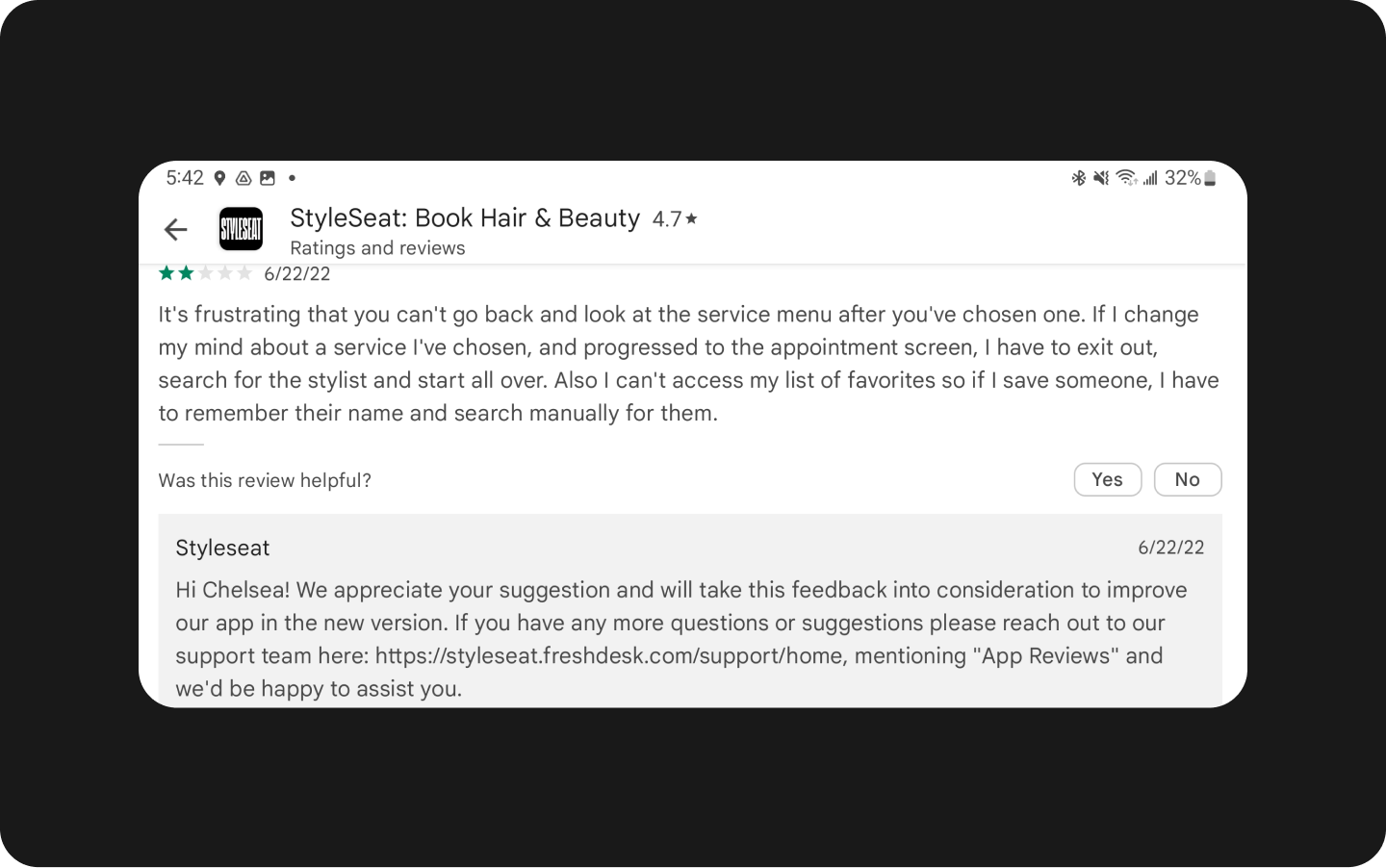
for this usability case study was to analyze and resolve user pain points that are publicly shared in the Google Play app reviews. StyleSeat is an app where users can book beauty consultations and appointments close to home or a favored stylist anywhere in the U.S.

For this exercise, I had to jump in the shoes of a specific user type, and I picked a young woman readying herself for her 25th birthday next month. For the big day she wants to get her hair braided in a specific style that is both cute and functional so she downloads the StyleSeat app and is pleased to find that there are thousands of stylists to choose from.
This soon to be 25-year-old woman works full-time, attends classes in the evenings, and does so all on public transportation. Having an app that can sort through various stylist options in a short amount of time while she is in transit is not only valuable, it’s necessary.
Based on her user journey, she likes:
The loading schema of endless scrolling.
The variation of stylist.
The map feature of finding stylist close to her and on her bus route.
The saved stylist is featured at the top of the app
Her daily transit includes switching between three bus routes, leaving her only a short amount of time to scroll through the options of stylist.
User scenario

When she selects a stylist to review their services and clicks the back button, the app forces her to go back to the top of the page and not where she left off.
Her goal is to find a hair stylist that has availability within close range and can braid her hair in the style that she is looking for. Because backtracking does not exist, the pain point is the user losing time while using the app.
That pain point creates usability issues that includes:
Not remembering where the user left off, as they are placed back at the top of the list of stylists.
Wasting a lot of time, as she needed to scroll through all the stylist options repeatedly.
I conducted an in-person focus group with five participants.
3 of the 5 were familiar with the app.
4 of the 5 participants had Android devices.
All participants were asked to scroll through to find a hair stylist that they would consider using based on availability and location.
Participants were timed to see how long it took them to find the stylists that they desired.
Participants averaged 18 minutes for scrolling, selecting the back button, and scrolling again.
The lack of backtracking resulted in participants expressing frustration with the app and not making a selection after more than fifteen minutes on the app.
Pain points and testing
Recommendation for redesign
Based on the research and industry best practices, chronological backtrack is an option, but Nielsen Norman Group recommends the single-revisit backtrack could work best, as it keeps track of what nodes have already been revisited during the current backtrack sequence, seen in sequence 3 in the image below.

This exercise was great to learn more about usability, and having to evaluate it myself on an (already well-designed) app. Such a task requires to be critical, and have a good knowledge of rules, interface codes, and usability in general.
What I realized is that a usability error is not per se gonna make a user abandon and quit the app or the website, but it gives more chances that the user after a few uses of the app, will eventually not use the app at all.
This also taught me is that in some cases, small friction is not going to prevent the user from achieving their goal. It will just make for a less positive user experience, which is well documented in the app reviews.
Thank you for taking the time to review my usability study. If you have feedback, please feel free to reach out to me on LinkedIn.